Day 3: Understanding Shopify Theme Settings and Components (Section, Layout and Templates) Part 2
Day 3 #
Welcome to Day 3! In the previous article, I explored the various components of Shopify Theme architecture. Today, we’ll delve deeper into developing blocks and settings, and how to bring them all together seamlessly.
Approach to Shopify Development Before Coding #
Shopify development has its unique challenges. With Shopify 2.0, developers must navigate schema definitions, settings, CSS root variables, theme configurations, block settings, Liquid templates, locales, and translations.
For newcomers, the complexity—especially when using Dawn as a starting point—can feel overwhelming. Dawn is packed with configurations and settings that showcase its customizability, but this wealth of options can be daunting at first. To simplify my workflow, I adopted a straightforward approach to Shopify development, which I’ll outline here.
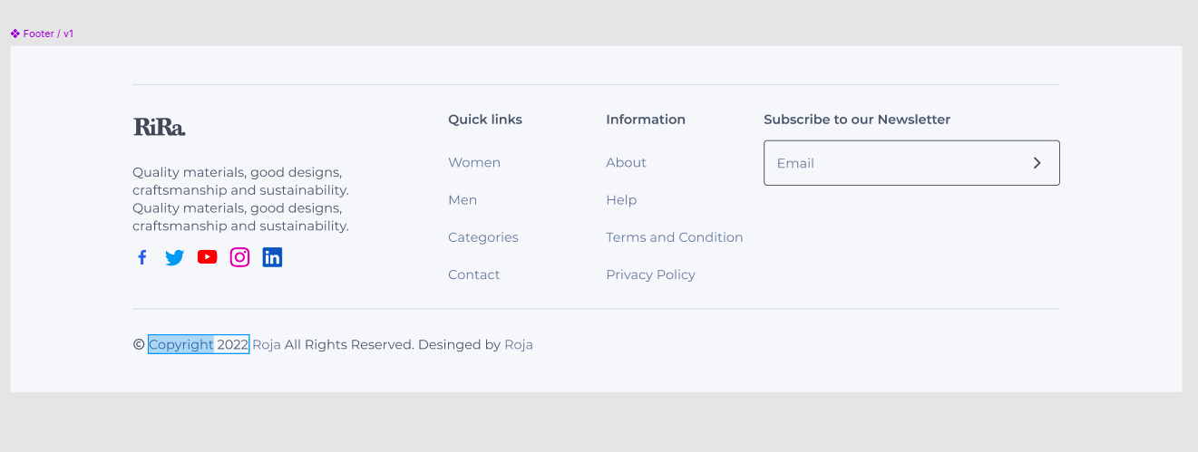
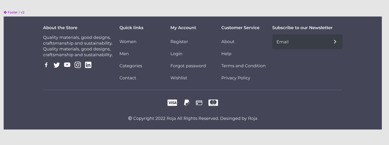
To provide context, here’s a screenshot of the footer design I was working on in Figma. My objective was to create a new block and align the “Newsletter” section with the row, as shown in the design. This required a solution that didn’t disrupt the existing code.

Steps to Achieve the Goal #
Translation: Start by creating translations for your theme. This ensures accessibility for users in different regions and helps identify labels and text for blocks, sections, and settings.
CSS Root Variables: Declaring CSS variables in both
theme.liquidand component-specific CSS files makes theme-wide styling changes (like colors) much easier. You can even integrate these variables with the theme settings for added flexibility.Theme Layout: Your
theme.liquidfile is the entry point for templates. Ensure it’s well-organized. Once your header and footer are set up, you can shift your focus to individual sections and blocks.Sections and Block Settings: Sections and blocks are pivotal for building Shopify UI components. Section settings are global, while block settings are specific to individual blocks. Settings, stored in the schema, control block visibility and content.
For this example, I added a block to footer_group.json. Below is a sample code snippet showing how I created a new block within the footer section:
{
  "name": "t:sections.footer.name",
  "type": "footer",
  "sections": {
    "footer": {
      "type": "footer",
      "blocks": {
        "footer-0": {
          "type": "link_list",
          "settings": {
            "heading": "Quick links",
            "menu": "footer"
          }
        },
        "footer-2": {
          "type": "footer_details",
          "settings": {
            "heading": "Subscribe to our emails"
          }
        }
      }
    }
  }
}
The above JSON instructs Shopify to include the footer section on the page. The footer.liquid file in the sections folder contains the Liquid code to render blocks and utilize the schema-defined settings.
Here’s a snippet of the block schema for footer_details:
{
  "type": "footer_details",
  "name": "Footer Details",
  "settings": [
    {
      "type": "checkbox",
      "id": "show_social",
      "default": true,
      "label": "Show Social Icons"
    },
    {
      "type": "inline_richtext",
      "id": "footer_text",
      "default": "Footer Text goes here..",
      "label": "Footer Text"
    }
  ]
}
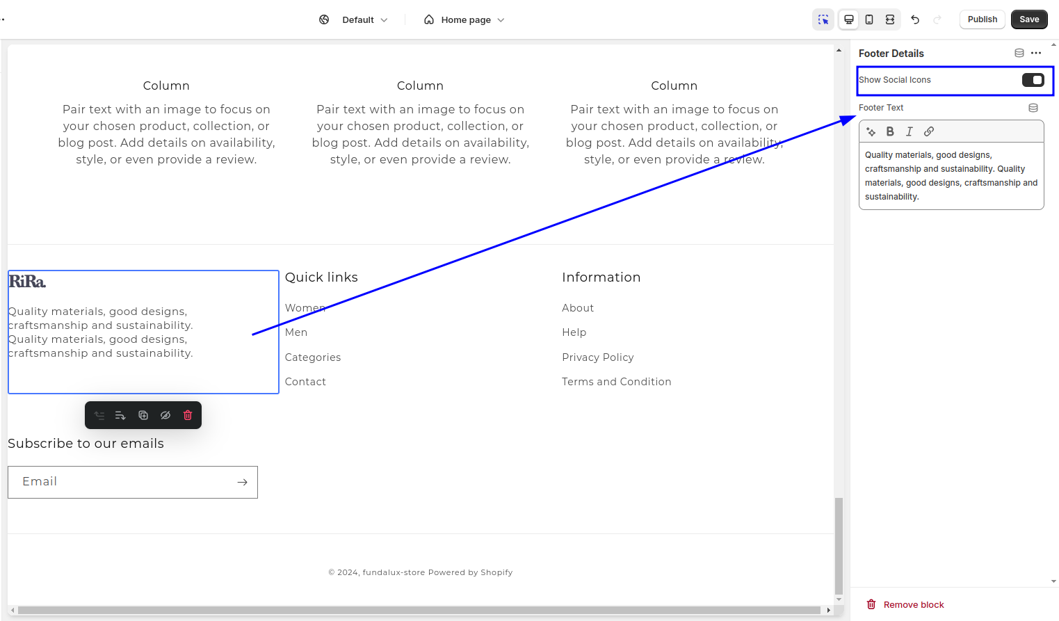
This block is part of the footer schema and defines settings like a checkbox to show social icons and an inline rich text field for custom footer text. Here’s how the block appears in the Shopify editor:

With these settings in place, you can use Liquid to dynamically render the block based on its configuration:
{% when 'footer_details' %}
                    <div class="footer-block__details-content flex flex-col">
                      {%- if block.settings.show_social -%}
                        <div class="header__heading-logo-wrapper">
                          {%- assign logo_alt = settings.logo.alt | default: shop.name | escape -%}
                          {%- assign logo_height = settings.logo_width | divided_by: settings.logo.aspect_ratio -%}
                          {% capture sizes %}(min-width: 750px) {{ settings.logo_width }}px, 50vw{% endcapture %}
                          {% capture widths %}{{ settings.logo_width }}, {{ settings.logo_width | times: 1.5 | round }}, {{ settings.logo_width | times: 2 }}{% endcapture %}
                          {{
                            settings.logo
                            | image_url: width: 600
                            | image_tag:
                              class: 'footer_details-logo mb-4',
                              widths: widths,
                              height: logo_height,
                              width: settings.logo_width,
                              alt: logo_alt,
                              sizes: sizes,
                              preload: true
                          }}
                        </div>
                      {%- else -%}
                        <span class="h2">{{ shop.name }}</span>
                      {%- endif -%}

                      {%- if block.settings.footer_text != blank -%}
                        {% liquid
                          assign block_count = section.blocks.size
                        %}
                        {% capture col-class %}{% if block_count > 9 %}w-1/4{% else %}w-10/12{% endif %}{% endcapture %}
                        <div class="text-2xl text-balance {{ col-class }}">{{ block.settings.footer_text }}</div>
                      {%- endif -%}
                    </div>
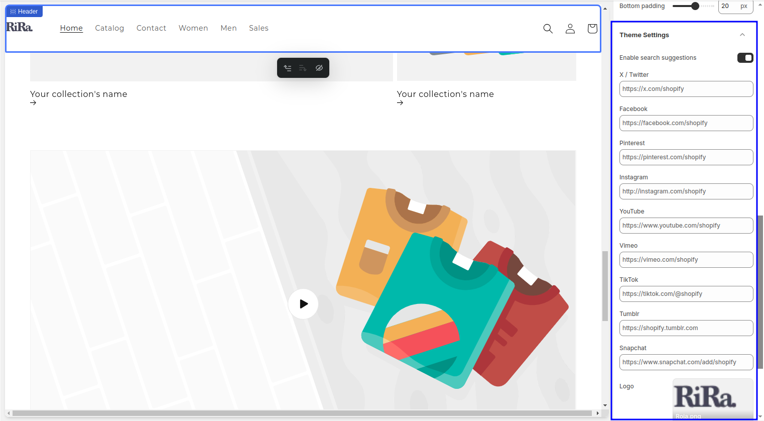
This code references the theme settings to check whether a logo is uploaded and whether the “Show Social Icons” option is enabled. It renders the logo, social icons, or footer text as needed.
Did you know ? #
I spent an hour trying to understand how theme settings integrate into sections, only to discover that using a specific theme setting in your section schema automatically adds it to the theme settings. Lesson learned—the hard way!

Conclusion #
 In the next post, I’ll focus on color schemes for each section and how to integrate them with theme settings. I’ll also cover more advanced Liquid concepts and explain how Dawn handles block rendering within sections. Stay tuned for more insights!