Day 2: Understanding Shopify Theme Settings and Components (Section, Layout and Templates)
Day 2 #
Welcome to Day 2 (technically Day 6) of building a Shopify 2.0 theme with TypeScript, Vite and Tailwind. Today I will be sharing my experience with my initial attempt at understanding the following Shopify architecture (Sections, Layout and Templates).
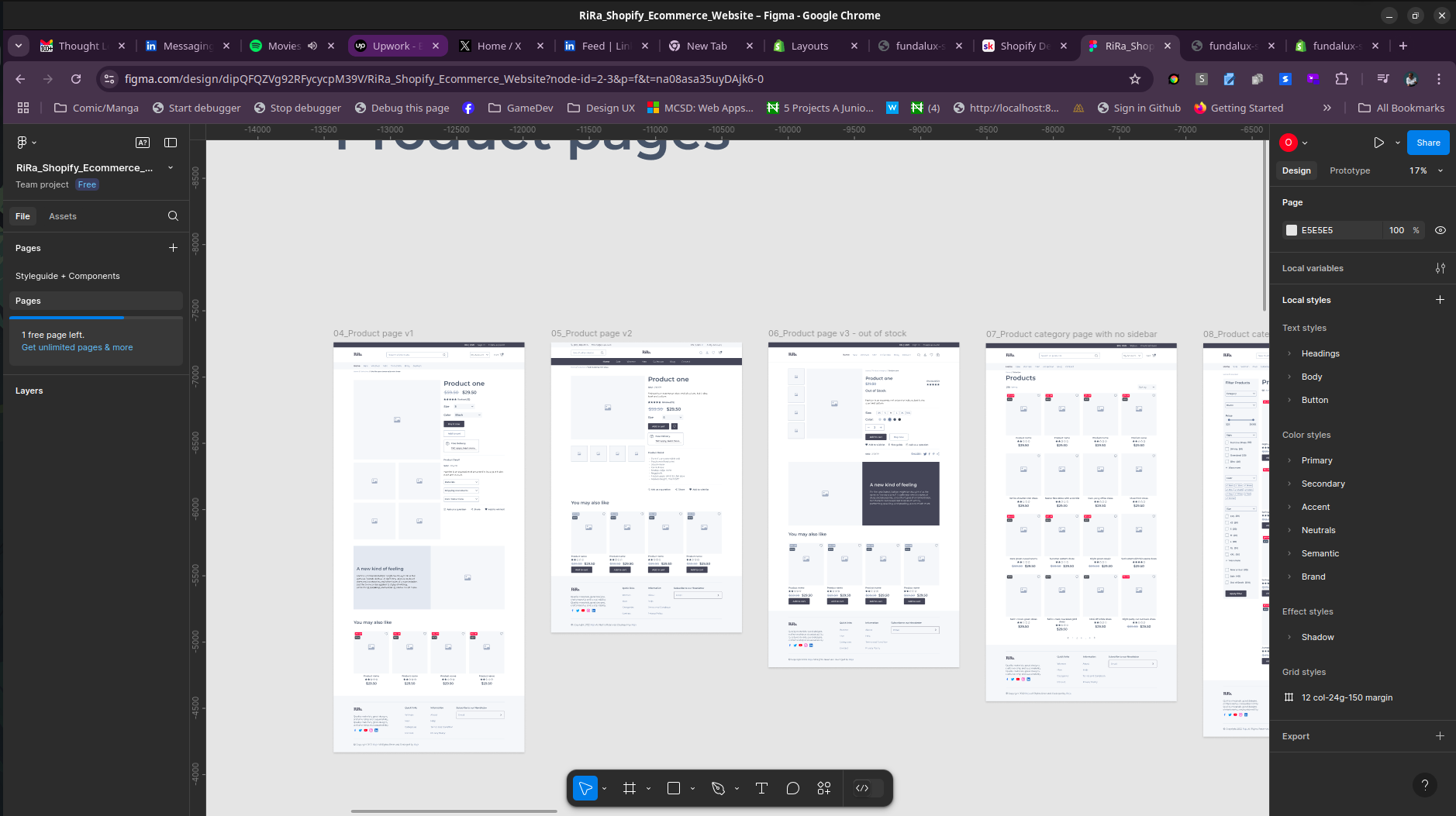
So I decided that the easiest way to ease into the development; was to start with the layout, templates and sections. I had to understand how these components work together to create a seamless experience for the user. But first here is a screenshot of the current theme in Figma.
The name of the Shopify theme is called “Rira” and it’s available on Themeforest.

The structure of a Shopify theme goes like this
Layout => Templates => Sections => Blocks => Block Settings
Layout #
The layout is the base UI of the theme, it’s similar to the master page in ASP.NET. It’s the first thing that gets loaded when a user visits the site. The layout consists of section, section groups and some liquid codes to insert assets like CSS and JS. So my first approach was to have the base skin implemented before working on each individual templates. It’s also possible for layouts to have static sections ( sections that are embedded in the layout through code), these sections cannot be removed, so it’s important not to abuse the use of static sections.
Templates #
Templates in Shopify are the pages that are rendered based on the URL. Unlike Shopify 1.0 , Shopify 2.0 adopts the use of Template JSON, these architecture allows you to add sections to the template. Think of it as Gutenberg for eCommerce. Sections are like placeholders for additional blocks.
Here is a sample of a template JSON
{
  "sections": {
    "main": {
      "type": "main-blog",
      "settings": {
        "layout": "collage",
        "show_image": true,
        "image_height": "medium",
        "show_date": true,
        "show_author": false,
        "padding_top": 36,
        "padding_bottom": 36
      }
    }
  },
  "order": [
    "main"
  ]
}
Sections #

Now let’s breakdown the JSON Structure for a template:
sections: This is an object that contains all the sections that will be rendered on the page. Each section has a unique key that is used to identify the section. A section contains a type and settings, these settings allow users customize the section to their taste almost similar to Gutenberg blocks.
A sections contains a schema that defines the settings and determines which blocks can be added to it, block are reusable components that can be easily removed and added to sections.
Blocks #
Blocks are reusable components that can be added to a section. They are so similar to Gutenberg blocks, but with a bit of a twist. They allow settings, and these blocks drive the rendering logic of the liquid template.
e.g A Multimedia section, a multimedia section can have multiple blocks that allows users to add images, videos and text.
There are multiple types of blocks and each type have specific ways of being declared and they are:
Theme blocks: These are blocks that are defined in the theme and can be used in any section. They are defined in the blocks folder of the theme.
App blocks: These are blocks that are defined by an app and can be used in any section. They are defined in the blocks folder of the app.
Section blocks: These are blocks that are defined in a section and can only be used in that section. They are defined in the blocks schema of the section.
Here’s a snippet of a block configured in a section schema
Header Group (Static Section in theme.liquid)
{
  "name": "t:sections.header.name",
  "type": "header",
  "sections": {
    "top-bar": {
      "type": "top-bar",
      "blocks": {
        "top-bar-0": {
          "type": "topbar",
          "settings": {
            "signInText": "Sign in",
            "createAccountText": "Create an account"
          }

        }
      },
    },
Top Bar Block
{{ 'section-top-bar.css' | asset_url | stylesheet_tag }}


<div class="top-bar-section flex justify-end py-3 gap-8 mr-64" id="{{ section.id }}">

  {% if section.blocks.first.settings.signInText != blank %}
    <a class="text-white" href="{{ routes.account_login_url }}">
      <span>{{ section.blocks.first.settings.signInText }}</span>
    </a>
  {% endif %}
  {% if section.blocks.first.settings.createAccountText != blank %}
    <a class="text-white" href="{{ routes.account_register_url }}">
      <span>{{ section.blocks.first.settings.createAccountText }}</span>
    </a>
  {% endif %}

</div>
{
  "name": "Top bar",
  "class": "top-bar-section",
  "settings": [
    {
      "type": "text",
      "id": "signInText",
      "label": "t:sections.top-bar.settings.signInText.label",
      "default": "t:sections.top-bar.settings.signInText.default"
    },
    {
      "type": "text",
      "id": "createAccountText",
      "label": "t:sections.top-bar.settings.createAccountText.label",
      "default": "t:sections.top-bar.settings.createAccountText.default"
    }
  ],
  "blocks": [
    {
      "type": "topbar",
      "name": "t:sections.top-bar.name",
      "limit": 1,
      "settings": [
        {
          "type": "text",
          "id": "signInText",
          "label": "t:sections.top-bar.settings.signInText.label",
          "default": "t:sections.top-bar.settings.signInText.default"
        },
        {
          "type": "text",
          "id": "createAccountText",
          "label": "t:sections.top-bar.settings.createAccountText.label",
          "default": "t:sections.top-bar.settings.createAccountText.default"
        }
      ]
    }
  ]
}
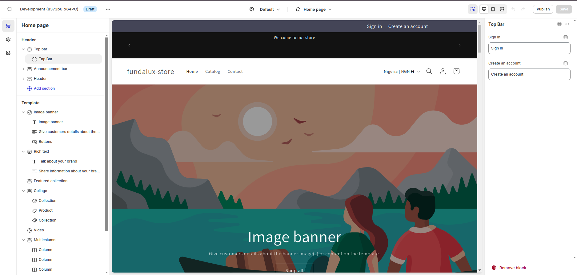
So what I did to create the Top bar from Figma, was to create a block with settings and localization. The block was then added to the section schema and the section was added to the template JSON.
If you notice, the template of the block is driven by the block settings, so whenever a user changes the settings of the block, the block will be re-rendered based on the new settings, I also used Tailwind CSS to avoid doing too much CSS.
Additional Notes #
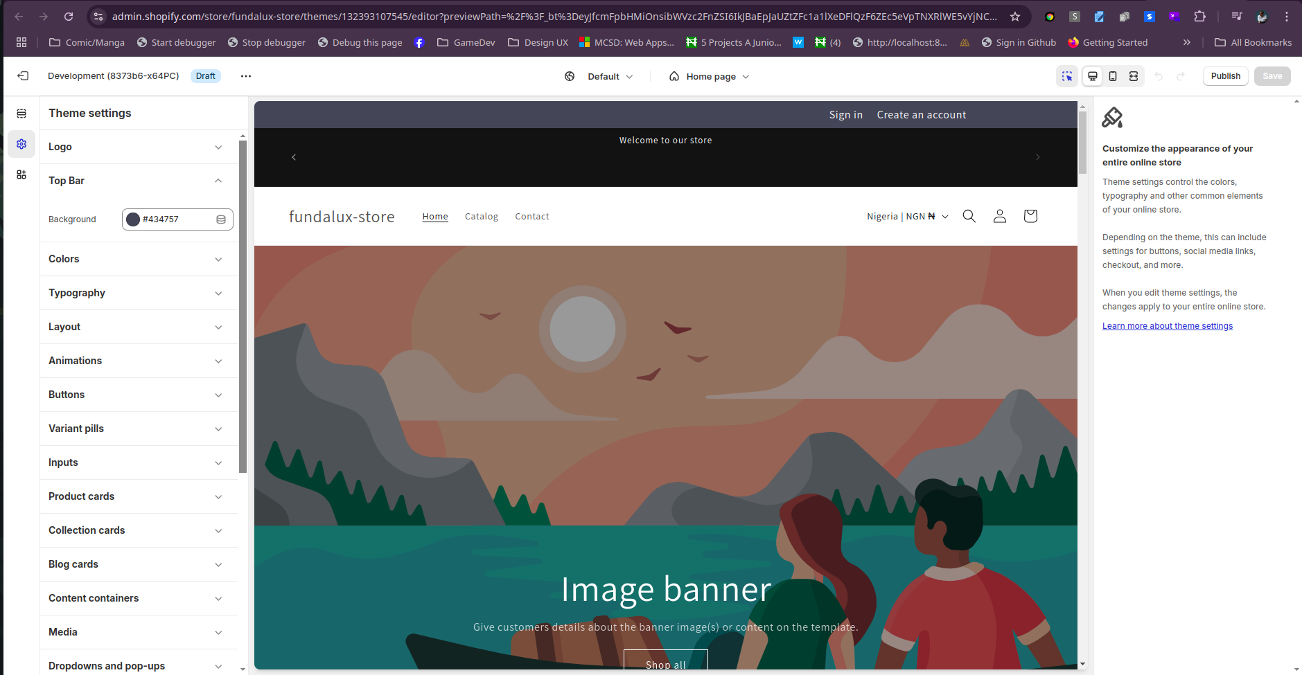
I also tied a Schema setting for the Top Bar component, meaning a color scheme can be used to customize the background color of the top bar.
{
  "type": "color",
  "id": "backgroundColor",
  "label": "t:sections.top-bar.settings.backgroundColor.label",
  "default": "#000000"
}
Then that color scheme is loaded into the root variable in theme.liquid
:root{
    --top-bar-background-color: ;
}
which is then used in the css
.top-bar-section{
    background-color: var(--top-bar-background-color);
}
This allows my theme to be easily configurable allowing users to change the color of the top bar without having to touch the code.

Conclusion #
Blocks, Sections and Templates initially can easily get overwhelming especially having to remember all the keywords and schema, but once you get the hang of it, it becomes seamless.
I will also recommend using VSCode and Copilot to help you write the schema faster. I normally write codes with Webstorm but until Zed and Webstorm can support Liquid, I will advise sticking to VSCode.
Ciao for now, see you tomorrow.