Day 1: Building a Shopify 2.0 Theme with TypeScript, Vite and Tailwind
Preface #
Welcome to my first day of building a Shopify 2.0 theme with TypeScript, Vite and Tailwind. Now this is my first time building a Shopify 2.0 theme, and I’m excited to share my journey, lessons learned, and maybe some tips along the way as I work on this theme. Let’s see where this adventure takes us!
Choice of Tools #
For this project, I will be using the following tools:
TypeScript (I love TypeScript so much, it helps me catch errors before runtime, and it’s a good practice to use it. The
@types/shopify-buypackage for Shopify development) is an important typing to have installed, it provides introspections for Shopify API, eliminating the need to consult the documentation. Decorators in Shopify themes are still yet to be explored, so there’s a possibility of building utility functions wrapped around decorators. I’m still thinking of the perfect way to use decorators in Shopify themes. I plan to write some Web Component specific decorator like the Lit framework.Tailwind CSS I chose Tailwind because it’s a utility-first CSS framework packed with classes like
bg-blue-500,text-center, andp-5. It’s a great choice for building Shopify themes because it allows you to build complex designs without leaving your HTML. I’m still thinking of the best way to integrate Tailwind with Shopify themes, I’m thinking of using the@tailwindcss/jitpackage for just-in-time compilation.Vite
Honestly I’ve always been a Webpack fan, but life is too short not to try new things, and configuring Vite with TS looks so seamless anyway so why not give it a try.
It should be noted that I didn’t do all these from scratch I followed an existing tutorial that helped me set up the project.
You can follow the project link at Shopify 2.0 Vite Setup
Note: When following the tutorial, do not use base.css as this will override Dawn’s copy.
Development Store #
I created a development store and enabled Developer Preview, I want the theme to support the early features as much as possible.
Testing TS and Web Components #
Shopify Dawn uses a lot of Web Components for interactive elements, the reason behind this is to eliminate the need for js frameworks, browsers have advanced to the level of supporting Web Components. This ensures that our theme is fast and lightweight.
So in order to test Typescript on the theme, I decided to write a simple Web component class called ShopifyComponent this component simply finds the button enclosed in it, attaches a text and listens for a click event.
class ShopifyComponent extends HTMLElement {
constructor() {
super();
// Let's find the button and attach a text
const button: HTMLButtonElement = this.querySelector('button');
if(button){
button.textContent = 'Buy now';
}
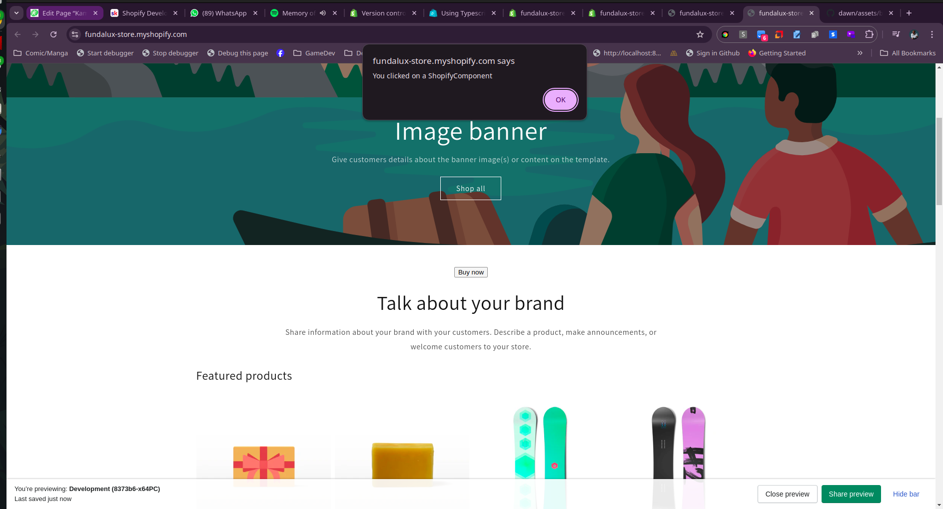
this.addEventListener('click', (e:MouseEvent) => {
// We attached a custom click to a component
alert('You clicked on a ShopifyComponent');
e.preventDefault();
e.stopPropagation()
});
}
}
customElements.define('shopify-component', ShopifyComponent);
The compiled JS version of the code looks like this:
class o extends HTMLElement{constructor(){super();const t=this.querySelector("button");t&&(t.textContent="Buy now"),this.addEventListener("click",e=>{alert("You clicked on a ShopifyComponent"),e.preventDefault(),e.stopPropagation()})}}customElements.define("shopify-component",o);
It’s not important for the code to be readable, the important thing is that it works and that the sourcemap is enabled during development.
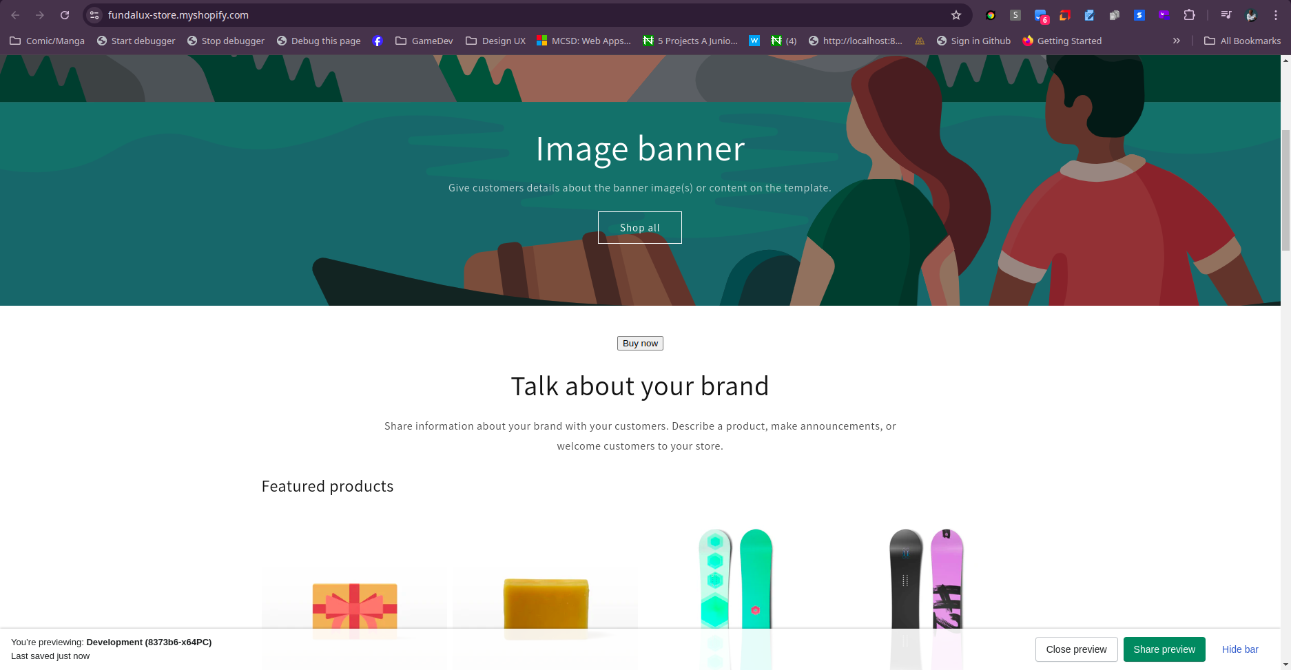
Moment of Truth #
So I loaded the code in the theme.liquid and added the web component to the rich-text snippet and viola it worked.
              <shopify-component>
                <Button></Button>
              </shopify-component>
Screenshots #
What’s Next? #
Day 2 will consist more of Theme settings, and components that will be used in the theme. I’m excited to see how this project turns out.